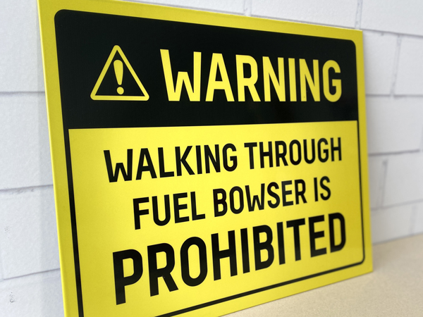
On a mine site, a safety sign should not need explaining.
If someone has to stop, squint, interpret the wording or wonder whether the instruction applies to them, the sign has already failed at its most important job.
Safety signage is not decoration. It is there to communicate clearly, quickly and consistently, often in environments where people are moving, operating equipment, wearing PPE, working in poor weather or dealing with noise and distractions.
In those conditions, ambiguity is dangerous.
A safety sign should answer the question immediately
A good safety sign tells someone what they need to know without making them work for it.
That might be:
- PPE required beyond this point
- authorised personnel only
- high voltage
- emergency assembly point
- no smoking
- vehicle exclusion zone
- restricted access
- chemical hazard
- speed limit
- emergency equipment location
The message should be obvious at a glance.
If someone needs to stand in front of the sign and read a paragraph, there is probably too much going on.
Mine sites are already complicated enough
Mining operations in Papua New Guinea can be large, busy and complex environments.
You may have employees, contractors, visitors, drivers and technical teams all moving through the same site, sometimes with different levels of familiarity with the operation.
That makes clear visual communication incredibly important.
People should not have to rely on local knowledge to understand where they can go, what PPE they need or what hazards are present.
Good signage helps remove that guesswork.
Consistency matters
One of the easiest ways to create confusion is to have different styles of safety signage across the same operation.
One building uses red headers.
Another uses yellow.
A contractor has brought in signs with completely different symbols.
Some signs use icons, others rely only on text.
Over time, the site starts to develop its own strange visual language.
The problem is that safety signage works best when people learn what to expect.
Consistent colours, symbols, layouts, terminology and placement make messages easier to recognise quickly.
The less thinking required, the better.
Bigger is not always better, but readable definitely is
A safety sign can contain the correct information and still be ineffective.
If the text is too small, the contrast is poor or the sign is mounted in the wrong location, nobody is going to read it at the point they actually need the information.
Consider where the sign will be viewed from.
Is someone walking towards it?
Driving?
Operating machinery?
Standing ten metres away?
Reading it in low light?
A sign at a reception entrance has a very different job from a warning sign beside a haul road.
The design needs to suit the environment.
Keep the language simple
Safety signage is not the place to show off your vocabulary.
Short, direct instructions usually work best.
Instead of trying to explain every possible scenario on one sign, communicate the primary message clearly and use supporting information where it is genuinely necessary.
There is a big difference between being thorough and being cluttered.
The best safety signs remove uncertainty rather than add more information.
Symbols help, but only when they are clear
Icons and recognised safety symbols can communicate extremely quickly, which is particularly useful on diverse workforces and sites where not everyone has the same first language.
But symbols still need to be used properly.
An obscure icon that nobody recognises is not better than clear wording.
Where possible, use familiar, standardised symbols alongside simple language. The two should support each other.
You should not need a meeting to explain what the sign means.
Location is part of the message
You can design the clearest safety sign in the world and still get it wrong if it is installed in the wrong place.
A PPE sign should appear before someone enters the area where the PPE is required.
A hazard warning should be visible before someone reaches the hazard.
Emergency signage needs to be visible from the places people are likely to be during an emergency.
It sounds obvious, but signage often gets treated as something to install wherever there is an empty wall.
The location should be part of the planning process from the beginning.
Worn-out signage sends the wrong message
Papua New Guinea’s conditions can be tough on signage.
Sun, humidity, heavy rain, dust and industrial environments all take their toll.
A faded sign, peeling vinyl or damaged panel is not simply an aesthetic problem.
It can become harder to read, easier to ignore and less credible.
There is also a broader message being sent.
If the safety signs around a site look neglected, what does that say about how seriously the organisation treats the safety system behind them?
People notice these things.
Review signage as the site changes
Mine sites evolve.
Traffic routes change. New buildings go up. Equipment is moved. Access areas change. Contractors arrive. Work zones expand.
But safety signage does not always keep pace.
That can leave signs pointing to old locations, warnings for hazards that no longer exist or, worse, missing signage around new hazards.
A regular signage audit helps identify those gaps.
Walk the site as if you have never been there before.
Could you work out where to go?
Would you know what PPE you needed?
Are hazards clearly identified before you reach them?
Can you find emergency equipment quickly?
If the answer is no, the signage needs attention.
Safety signage is part of site professionalism
Good signage contributes to more than compliance.
It makes a site feel controlled, organised and well managed.
That matters to employees, contractors, visitors, regulators and stakeholders.
When the same level of care is applied across safety signs, wayfinding, building identification, operational areas and branded environments, the whole site feels more professional.
It shows that somebody has thought about how people move through the operation and what information they need along the way.
That builds confidence.
The simplest test
Stand in front of the sign and ask:
Could someone who has never been here before understand this immediately?
Not after reading it twice.
Not after asking another worker.
Not after guessing what the symbol means.
Immediately.
Because on a mine site, safety communication should never depend on someone making the right guess.
If people have to guess, your safety sign has failed.
Need to review safety signage across your site?
Brand Hero PNG helps mining, resources and industrial organisations improve the consistency, clarity and presentation of signage across their operations.
We can assist with signage audits, artwork systems, safety and operational signage, wayfinding, site identification and rollout across multiple locations.
The aim is simple: make important information easier to see, easier to understand and easier to act on.