
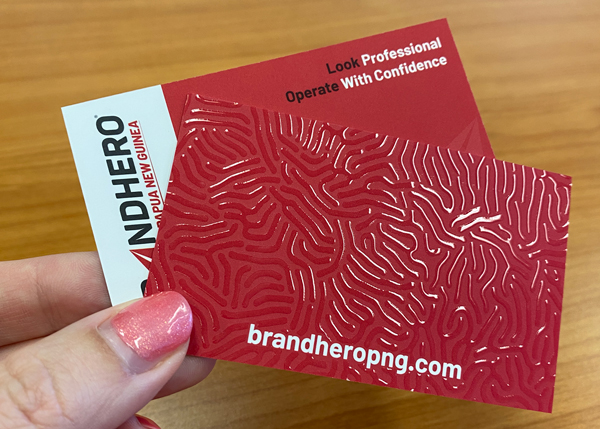
When we were in Sydney for PNG Investment Week, we had new business cards ready to go. Same logo. Same details. Same brand. The difference was the finish.
We chose raised spot UV on the logo. Subtle texture. A soft shine you could feel as soon as you picked it up.
And people noticed.
Every time we handed one over, there was a pause. Fingers ran across the surface. Then came the comments.
“That feels premium.”
“This is impressive.”
“Can you do cards like this for us?”
Before we had even explained what we do, the card had already done some of the talking. It quietly communicated quality, attention to detail and professionalism. It also became a conversation starter, which is exactly what a business card should be.
It was a good reminder that a strong first impression is not just about what information you include. It is about how clearly the card communicates who you are and the standard people can expect from you.
So what actually needs to go on a business card?
Start with the essentials
A business card exists for one reason. To help people remember you and contact you.
At a minimum, include:
- Your name
- Your company name and logo
- A phone number you actually answer
- A professional email address
- Your website
If it cannot do those things clearly, it is not doing its job. Keep it tight. A business card is not a brochure.
Less really is more
One of the most common mistakes is overcrowding. Too many phone numbers. Multiple emails. Every social platform. Full addresses that are never used.
If everything is important, nothing stands out. Choose the details that support the next step you want someone to take.
Use QR codes with intent
QR codes are practical now, not gimmicky. The key is where they lead.
Link to something useful like a booking page, digital business card or capability statement. Sending people to a generic homepage is often a missed opportunity.
Make sure the code is easy to scan and always test it before printing.
Design is communication
Design is not decoration. Layout, spacing, font choice and contrast all influence how professional your card feels.
Clean layouts with breathing room signal confidence. Legible type says you care about the person reading it. White space is not wasted space. It is often what makes a card feel considered and premium.
The feel of the card sets expectations
Card stock, weight and texture matter more than most people realise. A flimsy card suggests cost cutting. A heavier stock feels established and trustworthy.
Special finishes work best when used with restraint. Raised spot UV, foil or embossing should highlight one hero element, not everything. That tactile moment when someone feels the card is powerful for a reason.
Think about real-world use
Context matters. Heat, humidity, pockets and travel all take a toll. Laminated finishes, rounded corners and durable stocks often perform better in the real world.
If you operate across PNG and Australia, include country codes. Small details build confidence.
Your business card is a promise
A business card is often the first physical touchpoint with your brand. People judge your business by it, whether they realise it or not.
When it feels considered and professional, it works long after the handshake ends.
And sometimes, the smallest piece of print does the biggest job.