We attend a lot of expos and conferences across PNG and Australia, and one of the most useful things we do is simply walk the floor. Not to criticise, but to observe. To see which booths naturally draw people in, and which ones people walk past without a second glance.
Patterns emerge quickly. Certain booths spark conversation and feel easy to approach. Others, often representing strong businesses, struggle to cut through. Not because the offering is wrong, but because small design choices are working against them in a busy environment.
Expo floors are loud, crowded and fast-moving. People scan rather than study. That is where good booth design earns its keep.
You are competing with more than other booths
Your booth is competing with noise, screens, presentations, foot traffic and tired attendees short on time. Attention is limited and decisions are made in seconds.
You do not have minutes to explain. You have moments to register.
Your booth must make sense instantly
The most important question your booth needs to answer is simple.
Who are you, and why should I stop?
If someone has to slow down, read carefully or think too hard, they will keep walking. Effective booths communicate one clear idea, use plain language and prioritise clarity over cleverness.
In crowded rooms, clarity always wins.
Recognition beats detail
An expo booth is not the place for full explanations. Its job is to create recognition and open the door to conversation.
Strong booths focus on clear branding, consistent colours and typography, and a message people can grasp immediately. Details come later. Booths stop people. People build relationships.
Design for distance first
One of the most common mistakes is booth design that only works up close.
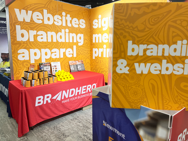
Most attendees see your stand from several metres away while moving. Good booth design uses large, confident type, strong contrast and minimal text. If it works across the aisle, it works everywhere.
Less messaging, more impact
Expos reward restraint. Walls of text become visual noise.
Choose one primary message, one supporting idea and one clear visual focus. Simplicity is not about having less to say. It is about saying the right thing at the right moment.
Layout shapes behaviour
Booth design is not just graphics. Structure matters.
A calm, organised layout feels approachable and professional. Think about where people stop, where conversations happen and where materials live when not in use. Order builds confidence.
Lighting and texture matter
Lighting is often overlooked, yet it draws the eye, improves contrast and lifts perceived quality instantly.
Tactile elements matter too. Quality print, solid counters and textured finishes slow people down. That pause is often where conversations begin.
Support conversations, do not replace them
Your booth should make it easier for your team to engage, not do all the talking itself. When design sets context clearly, your people can focus on people.
The real job of a great booth
A successful expo booth does not try to close deals on the spot. Its job is simple.
Be noticed.
Be understood.
Be remembered.
After many expo floors, one thing is clear.
The booths that work best are not the loudest.
They are the clearest.